
Raa Aarhus
When we began working with package-free store Raa Aarhus, they had been open all of two weeks. Our mission was to design and develop a mobile-first site, thinking of the ways in which we could create value for Raa and its customers.
Raa had neither a website nor a concrete visual identity when our project began. This provided us with a blank canvas: how bold and colourful could our brushstrokes be if we were given carte-blanche to design their webpage?
Connecting to Users
In any web design project, understanding users is crucial to creating a useful solution. We interviewed clients in-store, analyzed Raa’s existing demographic data, and collected survey results from 171 respondents online.
Users are looking for practical information.
The shop’s opening hours are at the top of every page, whether you’re on a phone, computer, or tablet.
Affordability is important.
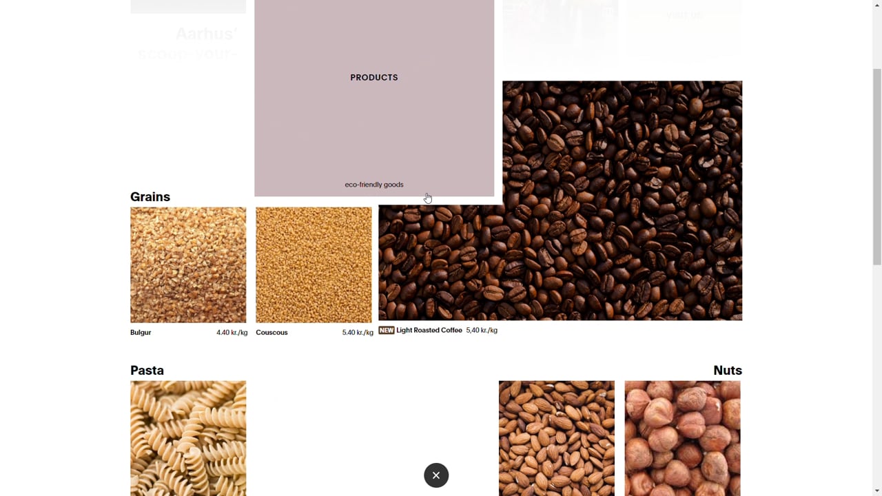
When asked what a package-free store should have, reasonable prices comes in at a near majority. Transparency about prices is crucial. The products page explains the pay-by-weight philosophy, lists prices, and notes the member discount.
Responsive Design
Built with a mobile-first approach, the layout adjusts according to screen size.


User Interaction Design
We’ve done away with the traditional navigation bar and replaced it with an interative layout. We were inspired by the storefront’s physical space when designing the menu.


The layout fulfils both form and function. Visually the rectangular shapes are connected by colour, shape, and alignment. On an interactive level, users see a change in opacity when they hover over elements. When they click on a title or image, it grows into a new page overlaying the menu.